
View My Chain
CLIENT
View My Chain – A platform that has been developed to help improve the current home moving process. It allows agents, buyers and sellers to view automated key buying and selling milestones.
BRIEF
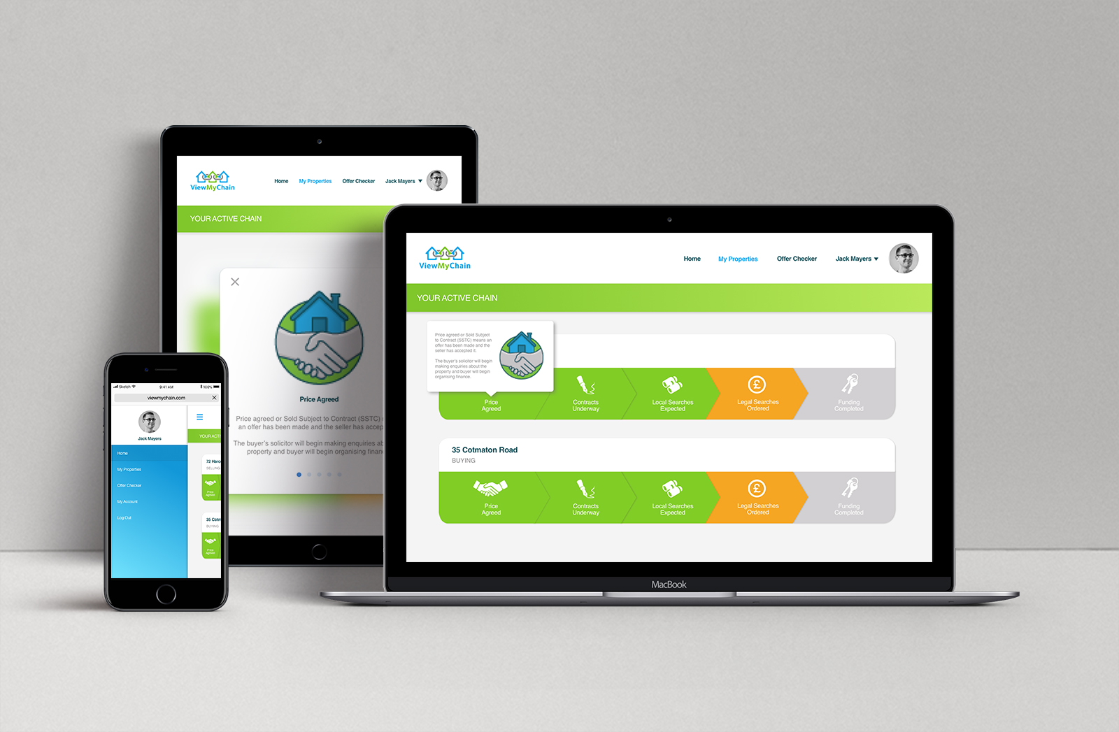
I worked closely with the project owner to improve VMC’s current customer view interface within their responsive website. The main aim was to create a way for a customer to see where they were within their property chain.
KEY UX CHALLENGES
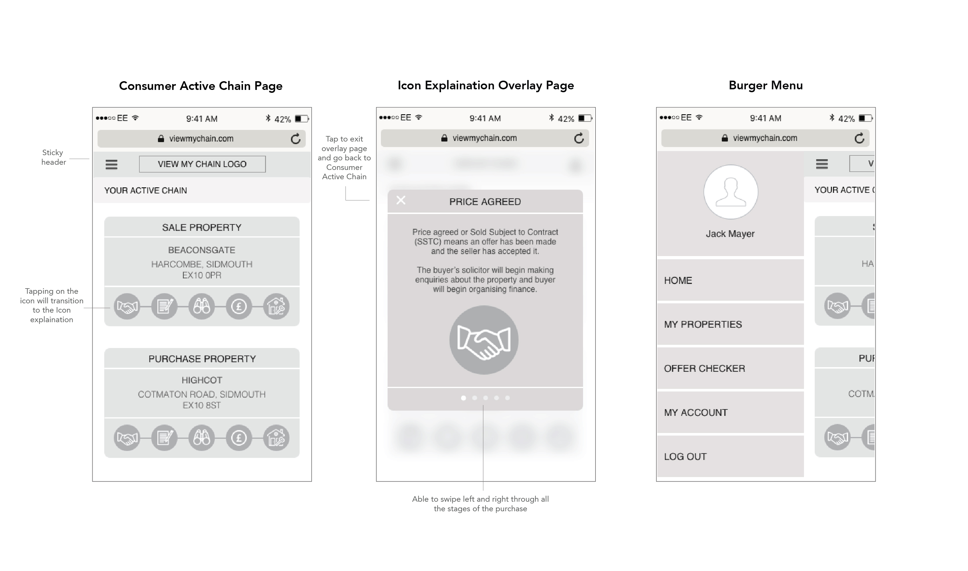
A lot of information to fit on a small UI
The customers main goal is to see the current status of their property they are buying and selling within the property chain. There are many stages within a property chain, and our goal is for the customer to immediately see where they are within this for both selling/purchase properties. It may be a challenge to fit this information within the screen, especially when designing for mobile.
If a customer is not familiar with the stages within the chain of a property purchase, they will need more information about these steps. However once familiar, they may not need to see this information again. Where is the best place for this information? There are many steps and in turn a lot of information regarding these steps. How do we show this information in a clear and concise way whilst ensuring it doesn’t get in the way of showing customers their property chain status?
Solution
- Designing mobile first – a way to focus and maintain clarity by removing any unnecessary UI decoration. When designing mobile first we are forced to give users the content they need. Which in turn strips any unnecessary elements and allows us to focus on what is essential.
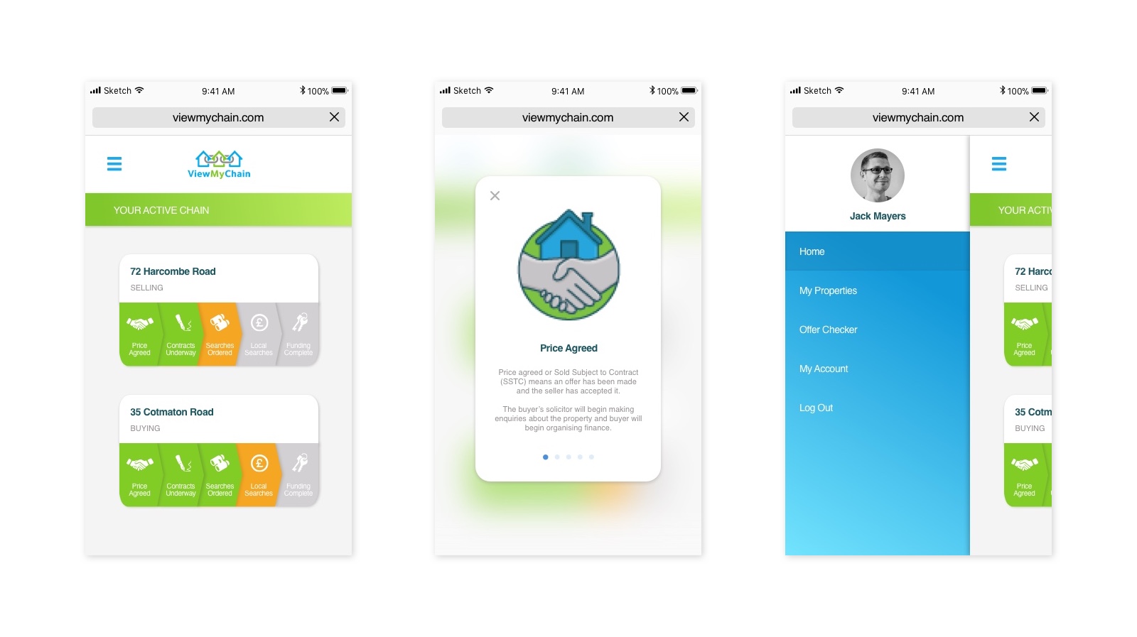
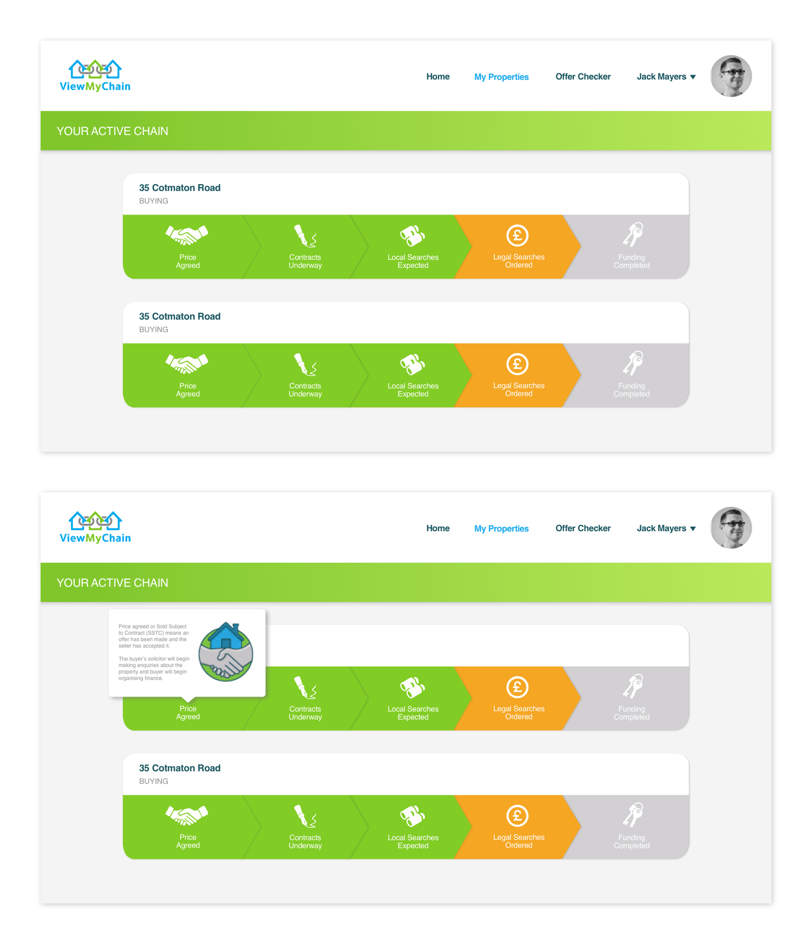
- Using a progress bar style design to show to the steps of the property chain. By ensuring the UI is minimal and also using colour to display the status of each step, customers should instantly see where they are within the chain.
- Allowing customers to click on the steps within the progress bar to see more information about the steps. This will ensure the information is available but will not distract from viewing the property chain status.
Wireframes
Mobile
Tablet

Desktop
Illustrations
